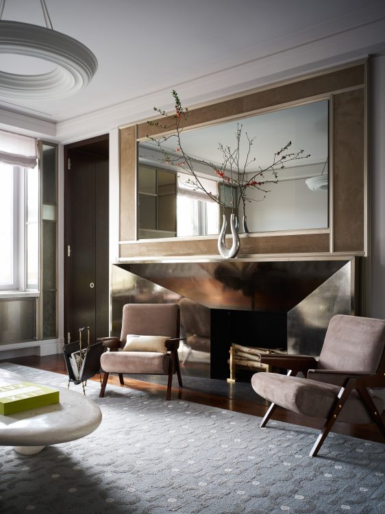
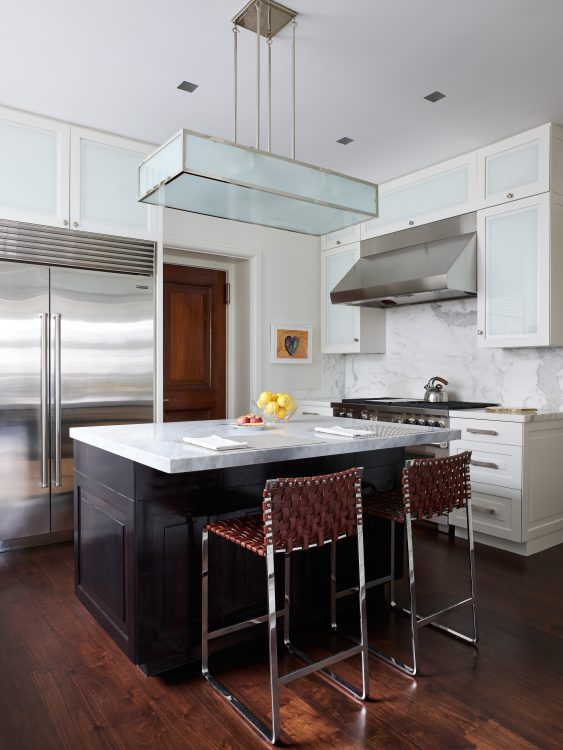
From The Quarterly, Issue 4: A dream client, a collaborative team, and a newly-doubled space: What better project could you ask for? DLN Members Michael Cox, Zuni Madeira, Doug Wright, and Matthew Tirschwel discuss their re-renovation of a Park Avenue apartment.

Doug: This client is one of a family for whom I’ve done quite a few projects: an estate in the Hamptons for his parents, a downtown apartment for him as a bachelor, and then this was an apartment when he got married and started having kids. The first one had a Soho loft feel; this one was Upper East Side but he really loved the openness of the loft, so we tried to capture the feel of that here. I worked with Michael Cox and Mary Foley on that renovation. Since then, I think we had all evolved, the client had evolved, so when he came to me four or five years ago and said he’d bought the apartment next door and here’s what he wanted to do, I was thrilled.
Michael: They, as most clients, are naturally evolving; they’re gaining more life experience, they’re gaining more reference points, right. I think on some levels, when it came to something like the collection of art—or even the more sophisticated thought process behind having a lighting designer—this project really represented their growth as clients.
Matthew: We had to really marry old with new, and our question was: is that going to be a limitation for us or an opportunity?
Michael: As the clients started seeing some of the design elements that Doug was putting together and Matthew was bringing, they started getting so excited about taking the whole thing to the next level. It was really the idea that, we can’t just do these new spaces, and have it not look cohesive, right? So they were thinking, how do we go back and really elevate some of what we did seven or eight years ago?
Doug: The level of finishes was really amped up. On the second round, we had all grown where the materials we were using were really exciting. When I was younger I never would have done a full onyx bath!
Zuni: Just going through the space, there’s an experience, visually, what you touch, what you feel and see. You’re going through the experience of all these beautiful, interesting interior architectural details, but there’s also this artistic, sort of moving experience, as you move through—and certainly live in—this apartment.
Doug: What I really loved, and I said this when we first did the project, too, is that this project is really beautiful because there’s no line between architecture and design—it’s so seamless.

Matthew: The art too—we’ve certainly had those clients where every single piece of art is individually wrapped in a bow of light. This was not that case. This was, fortunately, much more about the overall just living with light and living with art sort of simultaneously, and not having to make such a parade around it.
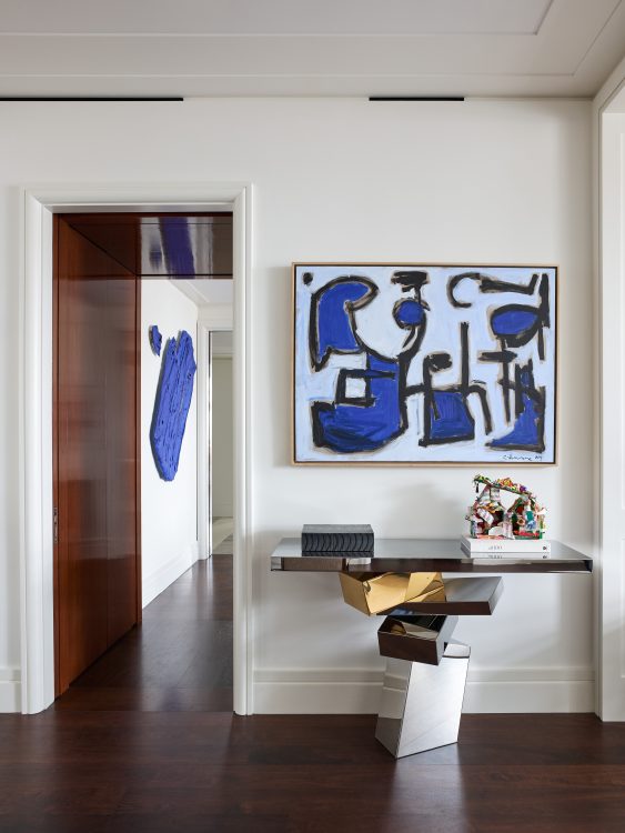
Michael: If you look at the photography, it does beg the question: Where does lighting end and where does art begin? Take the Ivan Navarro light sculpture that you see right when you walk in the apartment: That was very intentional. We had a lot of conversation about coming in and immediately having this sense of arrival.
Doug: The owner loved it before, but that piece grew out of wanting to have art really integrated with design and architecture. That piece is like a continuing portal when you first walk in. The fact that it’s a door to a closet makes it all the more fun. The big metal door to the private space is similar: When it’s closed, it looks like a cool art piece, especially seeing the reflections across it. It doesn’t even look like architecture. A big thing my clients always want is privacy and quiet, and what better privacy can you have than not even knowing it’s a door?
Zuni: They started in the first unit as a young family and with the first apartment, we were very intentional with creating spaces for entertaining but also for family time. With the newer space, that evolved to be more about their studies, and also about their time with their friends, doing things that are fun and interactive. I think you really see that with the study; yes, it’s about studying, but it’s also about their children having this free environment to enjoy that feels special but not like a grand apartment.
Doug: The previous design was a fantastic use of space; the unorthodox move there was to have the primary bedroom in the middle of the apartment; it was counterintuitive. So in some ways by having the extra space we made it more like a traditional Park Avenue apartment: we added a separate dining room where the primary bedroom used to be, we added that amazing bar right off the library, and then the new primary suite is at the end.

Michael: On some levels, from a very big picture perspective, we were able to actually designate those rectangles mostly as front of house, public space, shared, giving a delineation where you go more into family, private space. There’s definitely a sense—with the design, with the architecture, with the lighting—that this is where we entertain and then you step through this hallway and it feels much more cozy, intimate, private. It’s cohesive, but you definitely pick up on that difference.
Matthew: I think that’s one of the most successful parts of this whole project, is that delineation. I look at the metal doors separating the family room as a kind of portal—it’s almost like a time warp tunnel that transfers you to the private space.
Doug: What really makes this project great is having so much trust. The trust started on the first project with the client and with Michael and Mary and it continued on this one. And then Matthew introduced us to a lot of exciting technology that we never would have thought of. Those backlit bookcases, the lighting treatment in the playroom niches.
Zuni: We love to share our creative process as early as possible, because that’s how we create the synergy where we’re coming up with ideas that we become aligned on when we present to a client. That’s what starts to create this cohesion and this exciting process where things evolve and come together so well.
Matthew: From our side, it’s nice when there are opportunities like this, where lighting is really valued as part of the design element, and not just an add-on. It ultimately makes the design much more successful.