The famous Kips Bay Decorator Showhouse New York opens its 49th annual house tonight and, as always, the DLN is well-represented, with seven Member firms designing rooms and many Partner brands sponsoring the showcase. Read on to see what the DLN brought to this year’s space, and click here to buy tickets to see these—and all the rooms in the rambling, four-story townhouse—in person!
Kitchen by Karen Williams of St. Charles New York
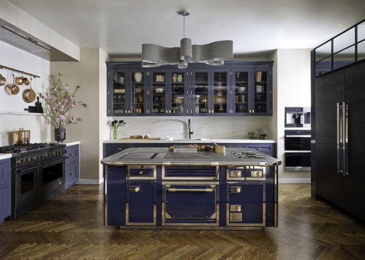
2024 © Nickolas Sargent Photography, Designed by Karen Williams
Karen Williams brought “a modern spin on traditional” to the spacious chef’s kitchen, which presents traditional elements like framed cabinets and brass trim in new ways (lacquer finish and unconventional handle shapes). “Long gone are pedestrian kitchens,” Karen proclaims. “It’s all about’ why wouldn’t you want the room you spend the most time in to be the one you love most?'” Her over-scaled, multi-functional island is designed to accommodate both meal prep and gathering. The cherry on top? The kitchen’s blue-and-brass scheme juxtaposes perfectly with the living space adjacent, designed by Alan Tanksley (a client of DLN Professional Member Melissa Mittag).
Wine Lounge by Beth Diana Smith
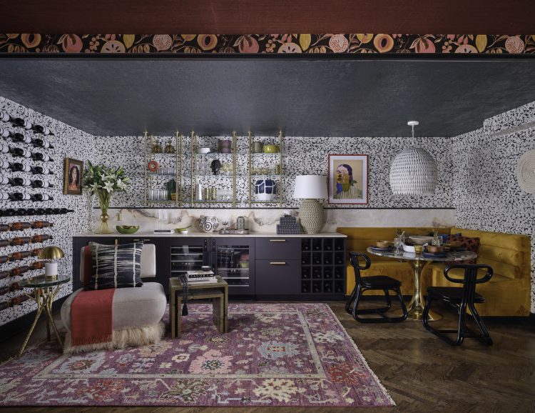
2024 © Nickolas Sargent Photography, Designed by Beth Diana Smith
When Beth Diana Smith found herself with an underwhelming basement space, she decided to pull out all the stops on a “wine cellar” by turning it into a wine lounge, wrapped in a lustrous oyster-shell wallpaper from Kravet. Besides lightening up the room, the wallcovering provides a textural backdrop to a shelf unit from Amuneal’s quick-ship collection and a slew of art, including one piece she picked up at the DLN Summit in Mexico City with Member Kelly Finley. Other DLN connections abound: The “not boring” hardware on her cabinetry (painted in a Benjamin Moore hue) is by Nest Studio, founded by Member Jessica Davis. Artistic Tile provided both the countertop and a striking green tabletop, while the lighting is from Vaughan.
Landing and Powder Room by Lucinda Loya
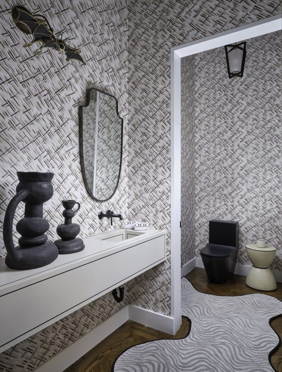
2024 © Nickolas Sargent Photography, Designed by Lucinda Loya
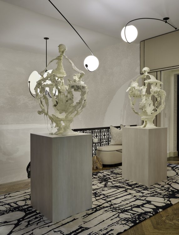
2024 © Nickolas Sargent Photography, Designed by Lucinda Loya
Dubbed “Enchanted Roots,” Lucunda Loya’s landing serves as a sneak preview of the rug collection she’s set to launch with The Rug Company next year. In the high-fashion powder room, meanwhile, a unique carpet by Stark covers with floors, while the walls showcase a custom design for Flavor Paper that will also soon be available for sale. The vanity was custom designed with Cosentino and boasts fixtures from Kohler.
Bar by Michelle Gerson
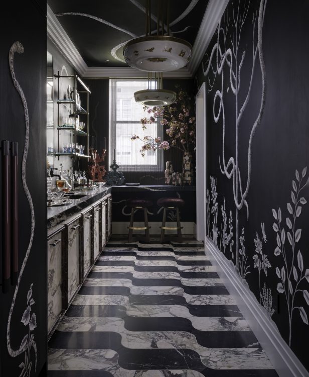
2024 © Nickolas Sargent Photography, Designed by Michelle Gerson
When Michelle Gerson landed a blah closet space on the second floor, she immediately decided to turn it into a bar, which she dubbed “The Watering Hole.” The space’s jumping-off point was marble. “People need to stop being afraid of it,” says Michelle, who covered the floor in a hypnotic pattern of Calacatta Viola and Nero Marquina by Artistic Tile and paneled her cabinet doors in slabs that weigh 70 pounds each(!!). Speaking of fears, the designer faced her own by commissioning MJ Atelier to design a mural featuring snakes, “which I’m afraid of,” she jokes. But rendered in plaster against a matte black paint from Benjamin Moore, these ones aren’t so scary.
Lounge by Workshop/APD
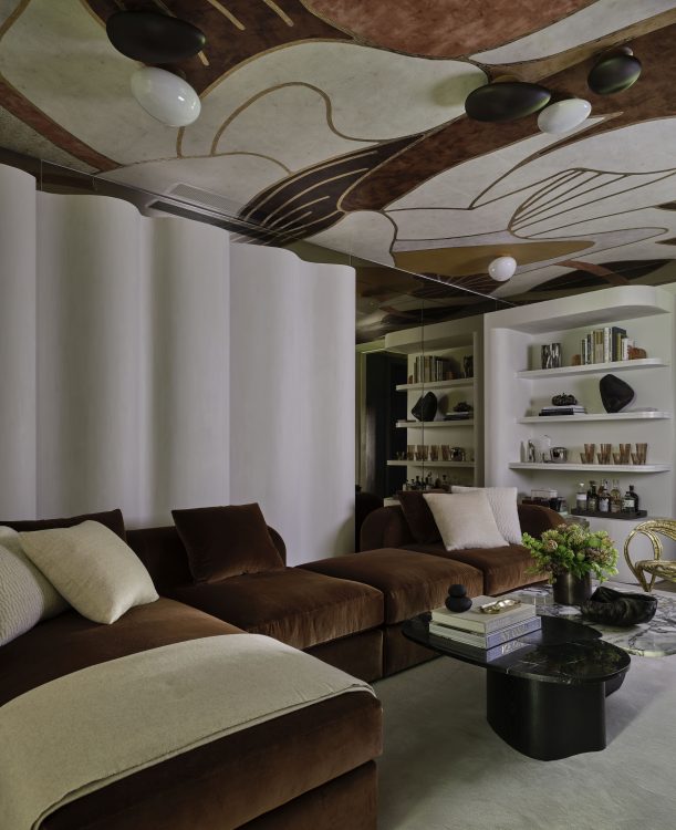
2024 © Nickolas Sargent Photography, Designed by Workshop/APD
“A showhouse is always so crazy, so we wanted to be a place you could come and relax,” says Matt Berman of the Smoke Lounge he and Andrew Kotchen designed. Their biggest hurdle? Beign in a windowless room, which the Workshop/APD team solved by creating a buildout of undulated walls topped with mirror-backed recessed ceiling lit by Ketra fixtures from Lutron. The sofa and coffee table are both from Workshop’s own collection (the table is a preview of an upcoming launch), while the ceiling wallpaper is an overscaled version of a Fromenthal design discovered during Paris Design Week.
Staircase by Swati Goorha
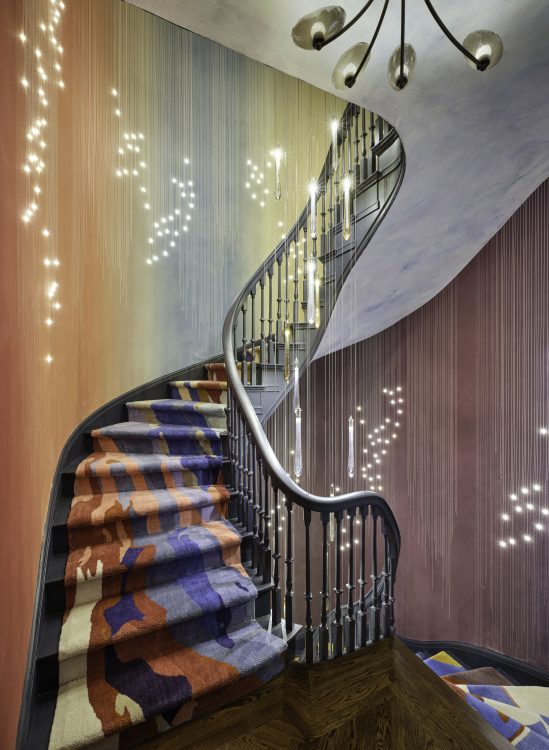
2024 © Nickolas Sargent Photography, Designed by Swati Goorha
“I didn’t want the staircase to get overlooked,” says Swati Goorha of her space—and rightfully so, since this year’s showhouse spans four stories. Swati worked with an LED wallpaper company to devise a wallcovering that features spekcled lights, giving the effect of a starry night sky. Paired with her custom rug and ceilings in Venetian plaster with mica, the paper creates a hypnotic color scheme that changes as you climb the stairs.
Terrace by Hollander Landscape Design
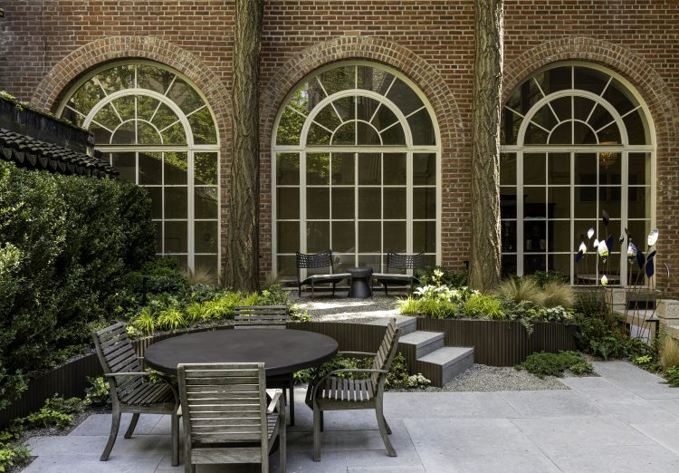
2024 © Nickolas Sargent Photography, Designed by Hollander Design Landscape Architects
In a subtle nod to the building’s former life as a Chinese cultural center, the Hollander team employed elements of Eastern and Western gardens in their multi-level terrace, which features a mixture of vintage wood (“for patina”) and new furniture from Brown Jordan as well as stone provided by ABC Stone.